
Color wields unseen influence over dining experiences—it stimulates appetites, guides conversation, and defines spatial perception. Choosing the Best Colors for a Dining Room Color Combinations isn’t merely aesthetic; it’s a strategic interplay of light science, material, and psychology.
In Bangalore’s interior design landscape—where Indiranagar’s heritage homes meet Whitefield’s contemporary penthouses—we’re seeing a shift toward intentional palettes. The era of safe beige is giving way to:
- Deep, mood-enhancing tones that create intimacy
- Metallic accents that dance with candlelight
- Organic neutrals that connect urban spaces to nature
This guide explores five sophisticated combinations that align with Interior Design Trends 2025, blending timeless principles with forward-thinking applications. Whether you’re hosting dinner parties or creating a family hub, these palettes transform meals into experiences.
“The right colors don’t decorate your dining room—they activate it.”
1. Midnight Navy + Burnished Gold
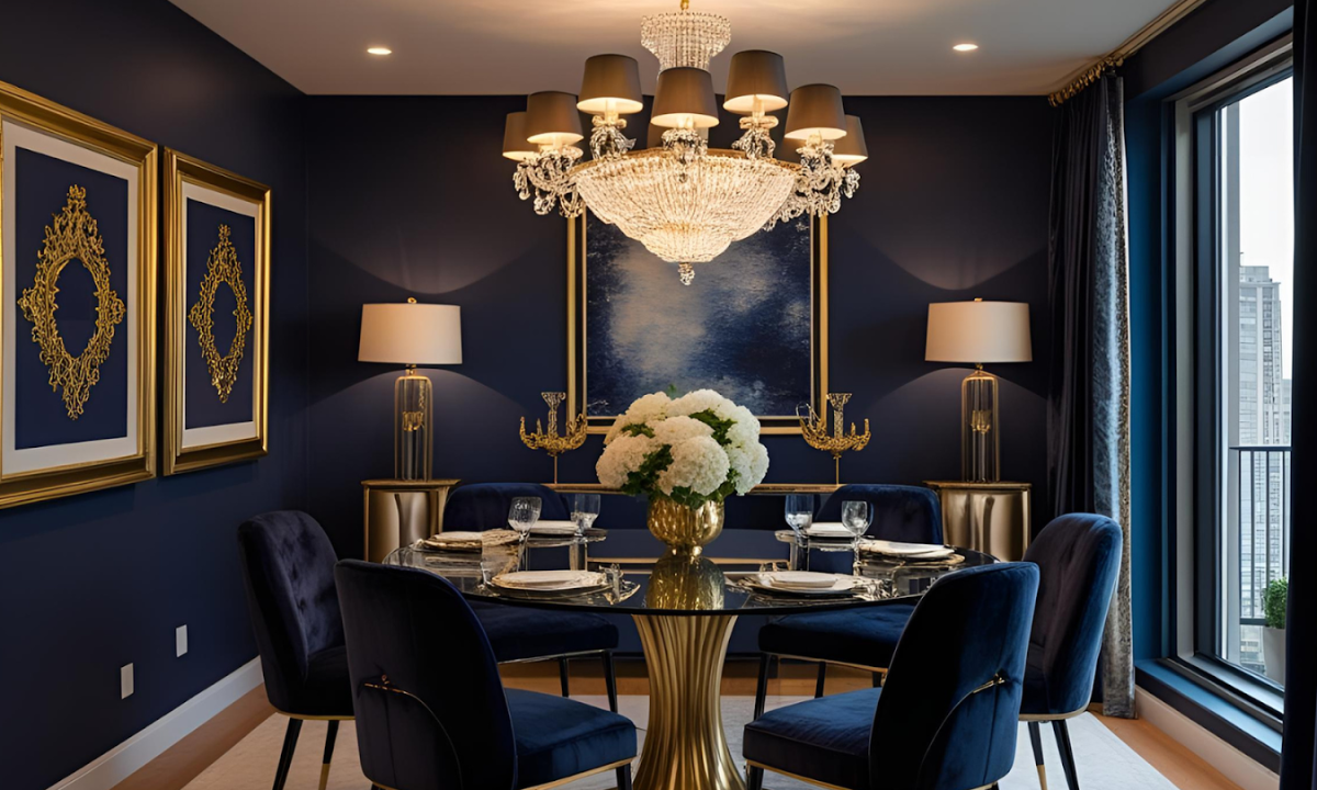
This timeless pairing creates instant sophistication. Navy’s depth absorbs light, making spaces feel intimate, while gold accents reflect candlelight for a luxurious glow, perfect for dinner parties.
Pair matte navy walls with satin gold sconces and walnut furniture for a classic look. The contrast highlights architectural details without overwhelming compact Bangalore dining areas.
2. Warm Greige + Terracotta
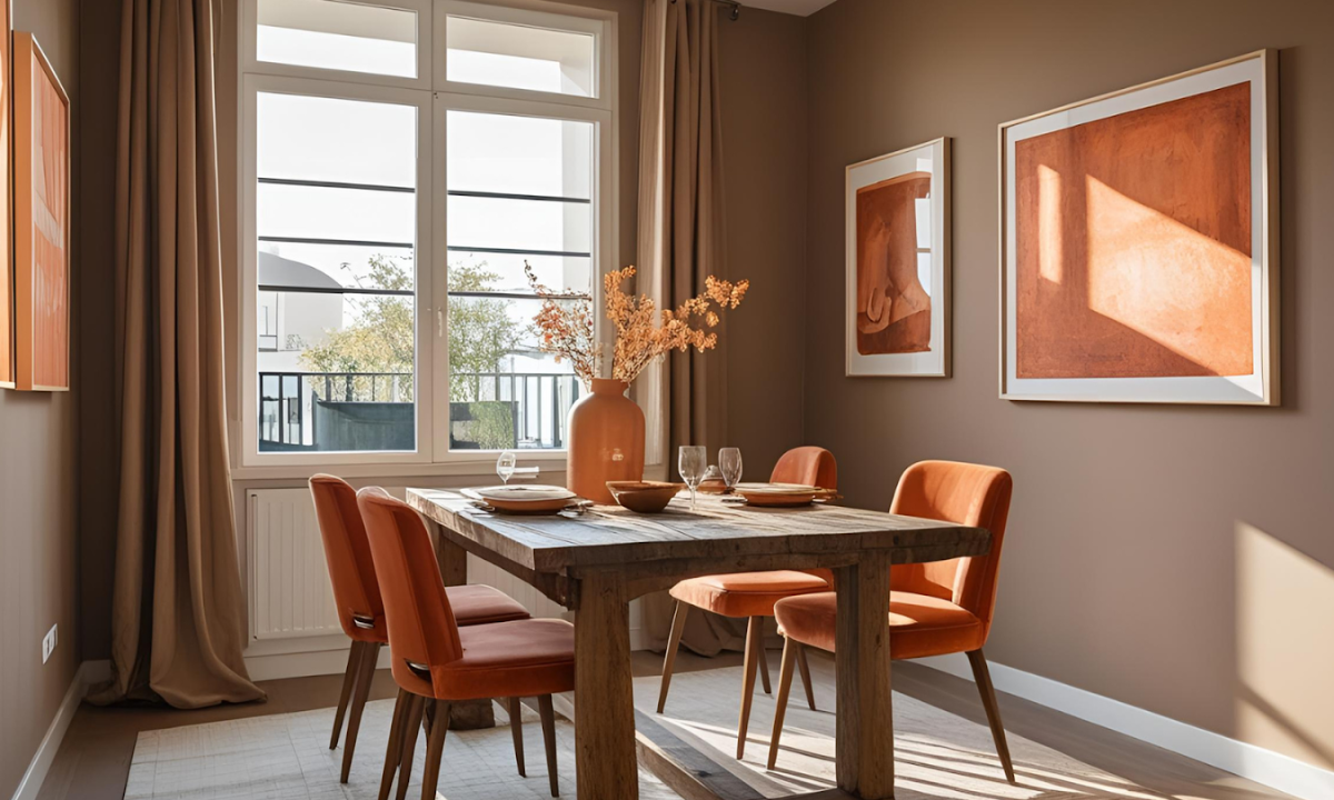
Earth tones naturally stimulate appetite and conversation. Greige provides a neutral canvas, while terracotta adds just enough warmth to feel inviting.
Best with 2700K lighting to enhance the organic vibe. Ideal for homes with Kota stone floors or exposed brick walls, common in Bangalore’s heritage properties.
3. Forest Green + Cream
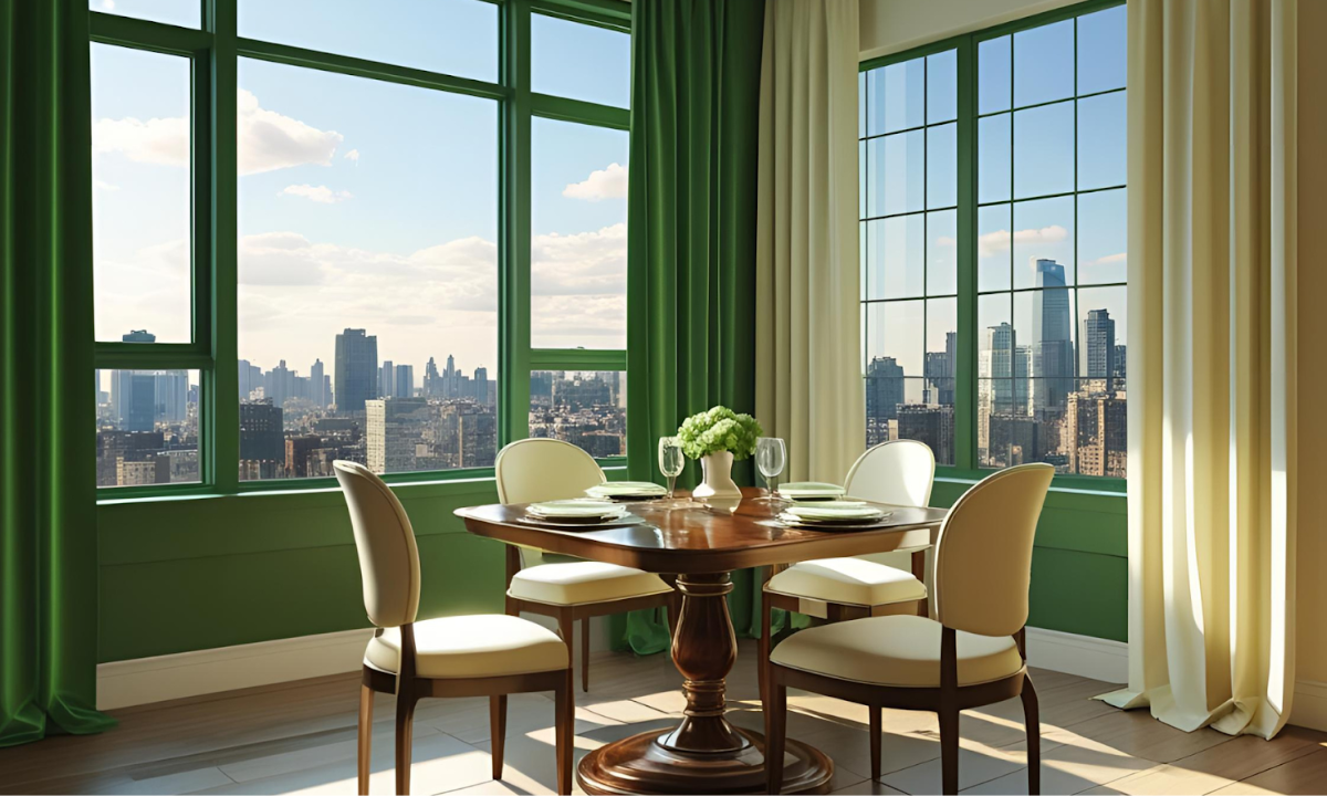
A biophilic combination that brings nature indoors. Deep green creates a cocooning effect, while cream keeps the space airy and balanced.
Complete the look with brass hardware and linen drapes. Particularly effective in apartments near Bangalore’s green belts, like Ulsoor.
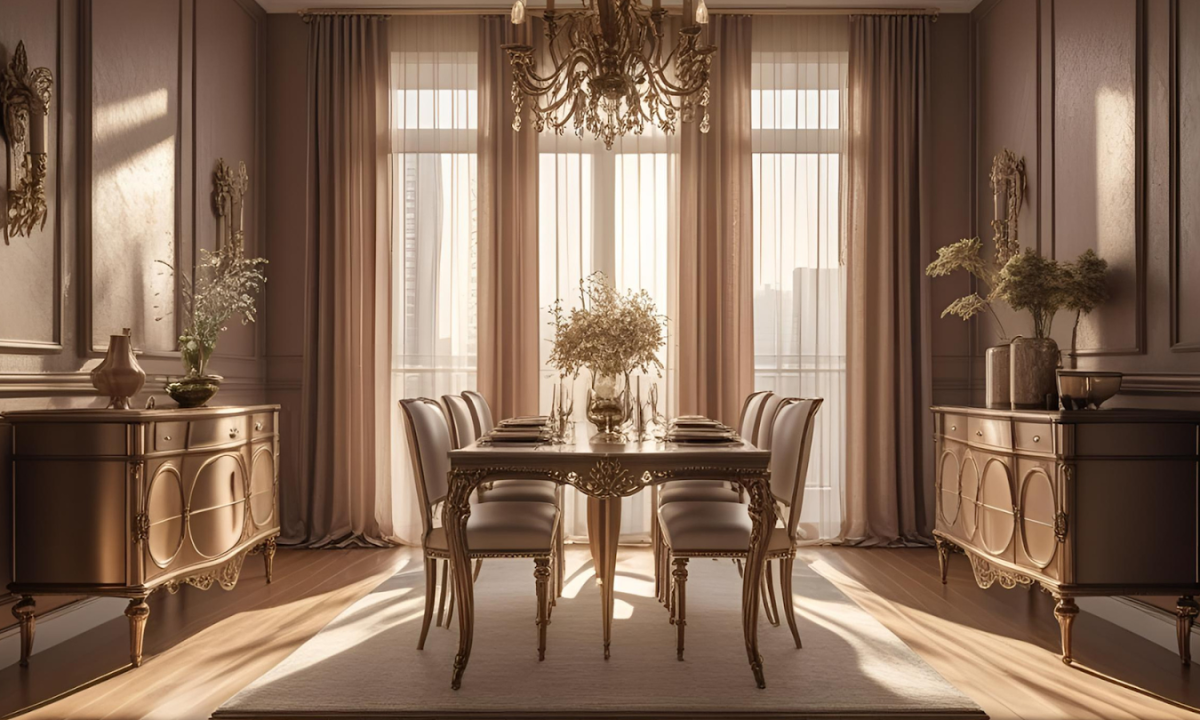
4. Charcoal + Blush Pink
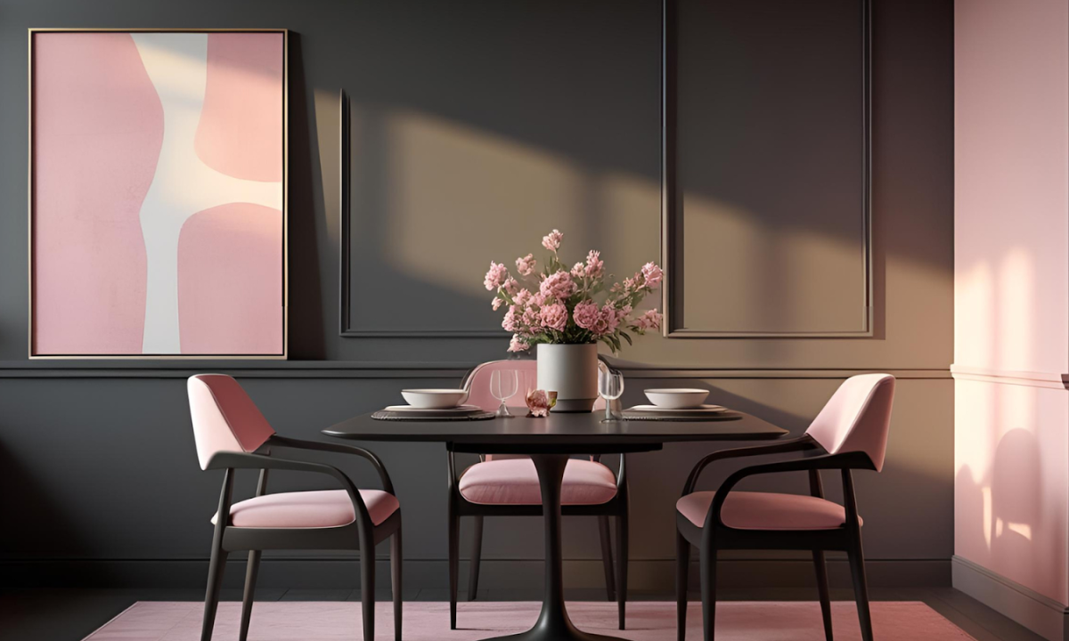
A modern twist on classic contrast. Charcoal grounds the space, while blush adds softness—great for contemporary lofts.
Add geometric black-and-white tableware for visual interest—a favorite among the Best Interior Designers in Bangalore for its gender-neutral appeal.
5. Taupe + Bronze
Understated elegance with depth. Taupe walls recede visually, while bronze accents develop a richer patina over time.
Hang pendant lights 30″ above the table to highlight metallic textures. Works beautifully in open-plan spaces, which are common in Whitefield’s newer developments.
Conclusion
The best Dining Room Color Scheme goes beyond trends—it creates atmosphere, influences mood, and elevates everyday meals into memorable moments. From the dramatic allure of midnight navy and Gold Color Combinations to the earthy warmth of beige and terracotta, each combination offers a unique sensory experience tailored to different lifestyles and spaces.
For those seeking expert execution, Bangalore’s top interior designers excel at translating these palettes into cohesive designs. Whether you prefer the natural elegance of forest green or the modern edge of charcoal and blush, the right colors will transform your dining area into a sophisticated hub for connection.
