Choosing the right Color Palette For Your Home is more than just a design decision—it’s a reflection of your personality, lifestyle, and even your profession. Colors have the power to influence your mood, energy levels, and overall well-being. Whether you’re a creative professional seeking inspiration or someone who values calm and tranquility, the colors you surround yourself with can make a significant difference.
In this blog, we’ll explore what color palettes are, how they impact your personality and mood, and guide you through some of the most famous color palettes to help you find the perfect one for your home.
What Are Color Palettes and How Do They Affect You?

A color palette is a carefully selected combination of colors used to create a cohesive and harmonious look in a space. It’s not just about aesthetics—colors can evoke emotions, influence behavior, and even affect productivity. For example:
- Warm colors like red, orange, and yellow are energizing and stimulating, making them great for social spaces like living rooms or dining areas.
- Cool colors like blue, green, and purple are calming and soothing, ideal for bedrooms or home offices.
- Neutral colors like white, beige, and gray provide a timeless and versatile backdrop, allowing you to experiment with accents and decor.
Your profession and personality also play a role in selecting the right palette. For instance, creative professionals might gravitate toward bold, vibrant colors, while those in high-stress jobs may prefer calming, neutral tones. Understanding these nuances can help you create a space that not only looks beautiful but also feels right for you.
Warm and Earthy Palettes

Warm Earth Tones
Colors: Rich cacao, sunset coral, earthy ochre, and sandy beige.
Earth Tone Colour Palette For Home, inspired by nature’s warmth, features rich cacao, sunset coral, earthy ochre, and sandy beige. These inviting colors create a grounded atmosphere that is perfect for living rooms or dining areas, especially when paired with natural textures like wood and stone. It’s a timeless choice for evoking warmth and coziness in rustic or bohemian-style homes.
Desert Chic
Colors: Terra cotta, sienna, cognac, ivory, and white.
Inspired by the California desert, this palette features warm neutrals like ivory and white alongside earthy tones such as terra cotta and sienna. It creates a serene, sun-kissed vibe that is ideal for living rooms or bedrooms. Pair it with high-contrast greenery like cacti or succulents to enhance the aesthetic, especially in spaces with natural textures.
Historical Romance
Colors: Soft gray, muted sage, pale blue, and golden orange.
This romantic palette features soft gray, muted sage, pale blue, and golden orange. It’s ideal for older homes, enhancing exposed brick and vintage details with a timeless, elegant vibe. Perfect for spaces where sophistication and charm are desired.
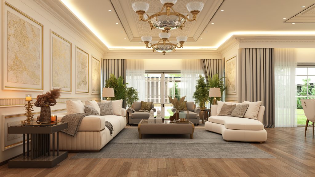
Airy Neutrals
Colors: Taupe, ivory, white, beige, and soft sage.
This warm, minimalist palette features taupe, ivory, white, beige, and soft sage, creating a cozy atmosphere that is ideal for living rooms or bedrooms. Its neutral tones allow for easy accessorizing with pops of color or natural textures like wood and linen, making it a timeless, calming choice.
Cool and Calm Palettes
Laid-Back Blues
Colors: Soft, neutral blues paired with light oak and creamy white.
This versatile palette features soft, neutral blues alongside light oak and creamy white, making it ideal for coastal, classic, or farmhouse designs. Perfect for living rooms or bedrooms, these calming blues create a serene environment, especially when paired with natural wood accents for an airy feel.
Coastal Neutrals
Colors: Barely-there blues, grays, sands, and whites.
Inspired by the Pacific coast, this palette features soft blues, grays, sands, and whites, ideal for a relaxed style in bathrooms, bedrooms, or vacation homes. The neutral tones evoke ocean calm and pair well with natural materials like rattan and driftwood. Add nautical accents for a complete coastal look.
Forest-Inspired
Colors: Deep olive green, moody black, earthy brown, and rich tan.
This palette features deep, cool tones inspired by a forest, including olive green, black, earthy brown, and rich tan. It’s perfect for bold living rooms or studies, complementing wood accents and greenery. For an elegant touch, add gold hardware.
Sweet Pastels
Colors: Soft pink, mint green, lavender, and baby blue.
Pastels like pink, mint green, lavender, and baby blue create a light and airy atmosphere, perfect for nurseries, kids’ rooms, or small apartments. Their calming effect also makes them a great choice for bedrooms or relaxation areas.
Bold and Eclectic Palettes
Palm Springs Modern
Colors: Citrine orange, ocean blue, palm tree green, and crisp white.
This vibrant, Palm Springs-inspired palette features citrine orange, ocean blue, palm tree green, and crisp white. Perfect for bright spaces, the bold colors add energy, while the white offers balance.
Rich Jewel Tones
Colors: Canary yellow, sapphire blue, ruby red, and orange topaz.
This luxurious, jewel-toned palette is perfect for adding drama and depth to a space. Use it in living or dining areas for a bold, sophisticated look.
High-Contrast Neutrals
Colors: Black, ivory, muted gray, and warm tan.
Black and ivory create a bold contrast, softened by gray and tan. This modern, minimalist palette suits a clean, contemporary aesthetic.
Eclectic Boho
Colors: Layered teals, blues, blacks, and a pop of fuchsia.
This vibrant palette includes layered teals, blues, blacks, and a pop of fuchsia, creating a quintessential bohemian vibe. It’s perfect for adding personality and color to a neutral backdrop, especially in living rooms or bedrooms. The bold, complementary colors work well with gold hardware and eclectic decor, making it ideal for those who love a bold, artistic aesthetic.
How to Choose the Right Palette for Your Home

1. Consider the Room’s Purpose:
Think about how you use the space. For example, calming colors work well in bedrooms, while energizing colors are better for living areas.
2. Assess Natural Light:
Rooms with lots of natural light can handle darker or bolder colors, while darker rooms benefit from lighter, reflective tones.
3. Match Your Personality:
Choose colors that resonate with your personality and lifestyle. If you love boldness, go for vibrant palettes; if you prefer calm, opt for neutrals or pastels.
4. Test Before Committing:
Always test paint samples on your walls to see how they look in different lighting throughout the day.
5. Seek Professional Help:
If you’re unsure, consult with the Best Interior Designers In Bangalore, who can guide you based on your preferences and the architectural features of your home.
Conclusion
Selecting the perfect color palette for your home is a deeply personal and impactful decision. It’s not just about aesthetics—it’s about creating a space that reflects your personality, supports your lifestyle, and enhances your mood. Whether you’re drawn to the calming tones of a coastal palette or the bold energy of jewel tones, there’s a color palette out there that’s perfect for you.
Frequently Asked Questions (FAQs)
1. How do I choose a color palette that suits my personality?
Your personality guides your palette choice. Bold, creative types may love Rich Jewel Tones or Eclectic Boho, while calm seekers might prefer Laid-Back Blues or Sweet Pastels. Nature lovers can opt for Warm Earth Tones or Forest-Inspired palettes. Choose colors that make you feel happy and relaxed.
2. Can I use multiple color palettes in different rooms?
Yes! Different palettes can define each room’s mood. Use calming Coastal Neutrals in bedrooms and vibrant Palm Springs Modern in living rooms. Ensure cohesion with shared neutrals or materials for a harmonious flow.
3. How do I test a color palette before committing?
Paint large swatches on walls and observe them in different lighting. Use online tools or consult interior designers for guidance. Test decor items or fabrics in your chosen colors to see how they interact with the space.
4. What’s the best color palette for small spaces?
Light, neutral palettes like Airy Neutrals or Sweet Pastels make small spaces feel larger. Add depth with an accent wall in darker shades like Forest-Inspired or Rich Jewel Tones. Balance light and dark tones to avoid overwhelming the room.
5. How do I use bold colors without overwhelming my home?
Choosing which color is best for the home is a hassle. Use bold colors as accents, like a Rich Jewel Tones sofa or a Palm Springs Modern accent wall. Pair them with neutrals like white or gray for balance. Incorporate bold hues through decor items like cushions, rugs, or artwork for a vibrant yet balanced look.
Take your time to explore these popular palettes, experiment with samples, and don’t hesitate to seek professional advice if needed. Your home is your sanctuary, and the right colors can make it truly special. Happy decorating!