

The top kitchen colour combinations trending in 2026 are all about creating warm, stylish and timeless spaces. From earthy greens and warm neutrals to soft blues, natural wood and elegant two-tone palettes, modern kitchens are moving towards colours that feel inviting while maintaining a luxurious appeal.
Popular combinations such as sage green and cream, warm white and natural wood, olive green and walnut, dusty blue and light oak, terracotta and off-white, and charcoal with warm wood are perfect for contemporary and luxury kitchen interiors. For homeowners who prefer brighter spaces, shades like peach, sunshine yellow, mint green, sky blue and coral can add freshness and personality.
When choosing a kitchen colour combination, consider the size of the kitchen, natural lighting, cabinetry, countertops, backsplash and overall home décor. The right balance of colours can make a kitchen feel more spacious, elegant and functional.
At The KariGhars, we believe kitchen colours should reflect your personality while complementing the architecture and lifestyle of your home. Whether you prefer a minimalist palette or a bold statement kitchen, thoughtful colour selection can transform your kitchen into a sophisticated and inviting space.
In compact urban kitchens, colour does more than decorate—it solves problems. The exemplary Interior Design for the Kitchen and Colour Combination for an Indian Kitchen can make a 100 sq ft space feel airy, hide inevitable oil splatters, and even influence how quickly you tire while cooking. As 2026 trends emerge, we’re moving beyond safe neutrals into palettes that balance bold personality with Indian practicality.
This isn’t about fleeting fads. The Best Colours for a Kitchen are:
- Bangalore’s light (harsh southern sun vs. dim northern exposures)
- Indian cooking realities (turmeric-stain camouflage)
- Modular flexibility (how hues pair with laminates and hardware)
From earthy terracottas that whisper “heritage home” to moody blues that hide urban dust, these 10 curated Colour Combinations for Indian Kitchen designs deliver beauty that works as hard as you do, no matter if it is a modular kitchen or a traditional one!
How to Choose the Right Kitchen Colour in 2026
Choosing the right kitchen colour in 2026 is about balancing current trends with timeless design. Warm neutrals, earthy greens, muted blues and natural wood tones are becoming popular choices for creating sophisticated kitchens. Consider factors such as the kitchen size, natural lighting, countertop, backsplash and overall home interiors before selecting a colour. For a luxurious yet timeless look, combinations such as warm white with natural wood, sage green with cream, or olive with walnut can add warmth, depth and elegance while keeping the kitchen visually refined.
Best two-tone kitchen cabinet colours 2026
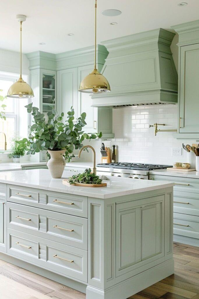
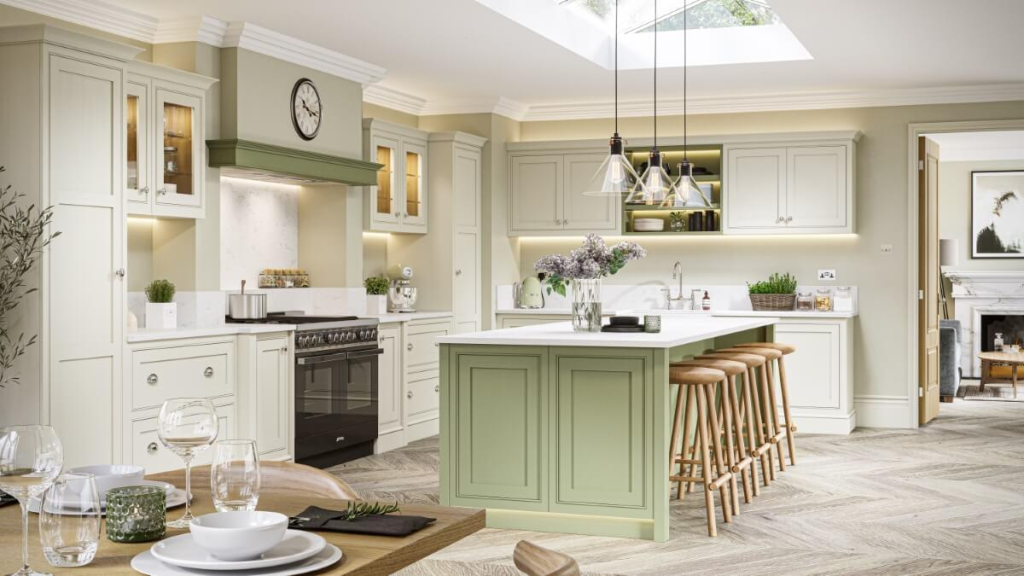
1. Sage Green + Cream — Soft, Elegant & Natural
Sage green paired with cream is one of the most elegant choices for a contemporary kitchen. The muted green brings a natural, calming character, while cream keeps the space bright and sophisticated. Add natural wood, marble or brushed brass accents for a luxurious finish. Green paired with wood and warm neutrals is particularly strong in current kitchen design
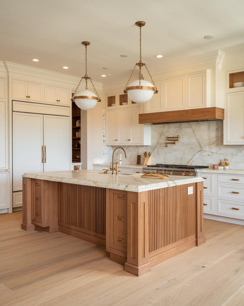
2. Warm White + Natural Wood — Timeless & Luxurious
Warm white and natural wood create a sophisticated kitchen that feels both contemporary and inviting. Unlike stark white, warmer whites add softness, while oak or walnut introduces texture and warmth. This is an excellent choice for homeowners who want a minimalist kitchen that won’t look dated easily. Natural wood is particularly prominent in 2026 kitchen cabinetry trends.
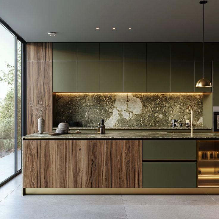
3. Olive Green + Walnut — Rich & Sophisticated
Olive green and walnut create a deeper, more luxurious palette while maintaining an earthy character. The combination works particularly well when you want the kitchen to feel warm, grounded and premium rather than overly bright. Olive and deeper green tones are among the notable 2026 colour directions.
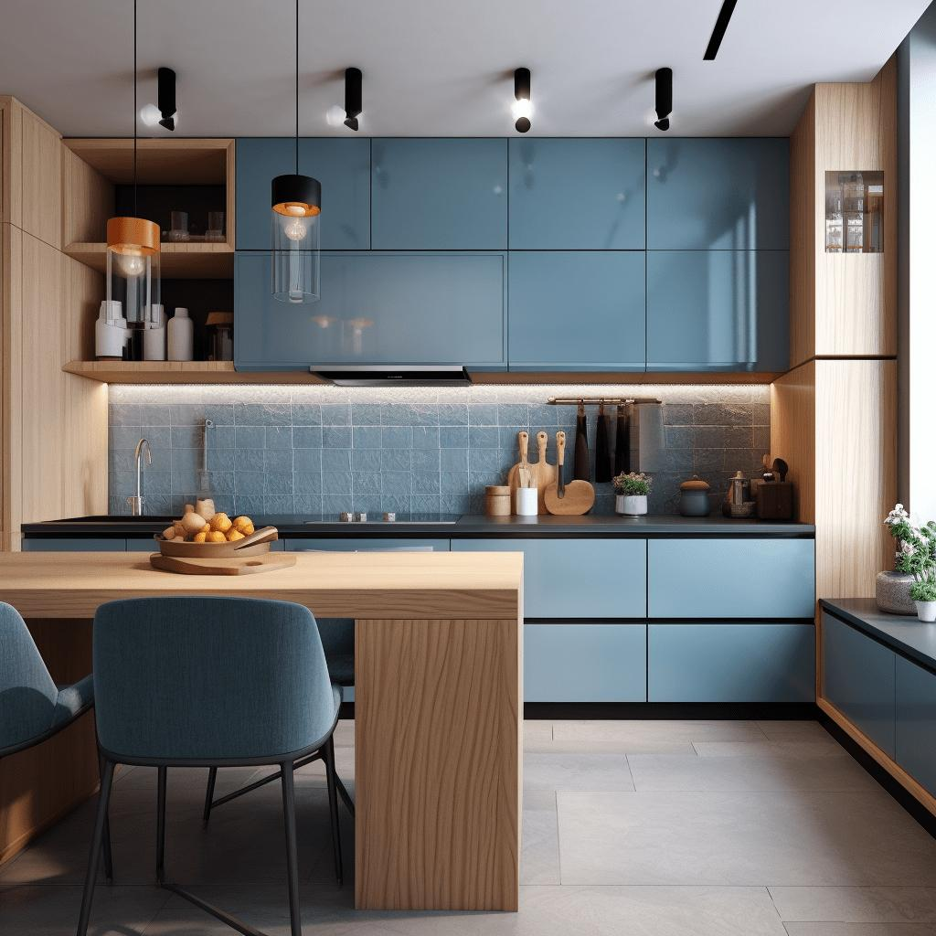
4. Dusty Blue + Light Oak — Calm & Contemporary
Dusty blue offers a softer alternative to stronger navy shades. Combined with light oak, it creates a kitchen that feels fresh, understated and contemporary. The wood prevents blue from feeling too cold, while the muted blue introduces just enough colour to give the kitchen personality. Blue and wood combinations continue to feature strongly in contemporary kitchen design.
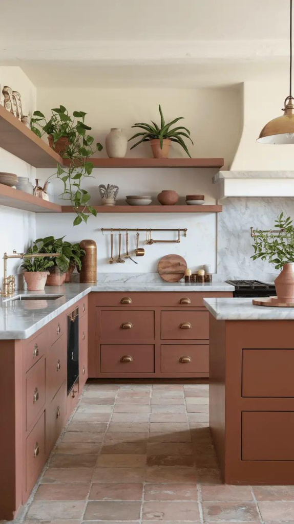
5. Terracotta + Off-White — Warm & Distinctively Indian
Terracotta and off-white bring warmth and character to the kitchen without making it feel overly colourful. The earthy terracotta tone works beautifully with natural wood, stone and muted metallic finishes. This combination is particularly interesting for Indian homes, where warmer earthy tones can complement the broader interior palette.
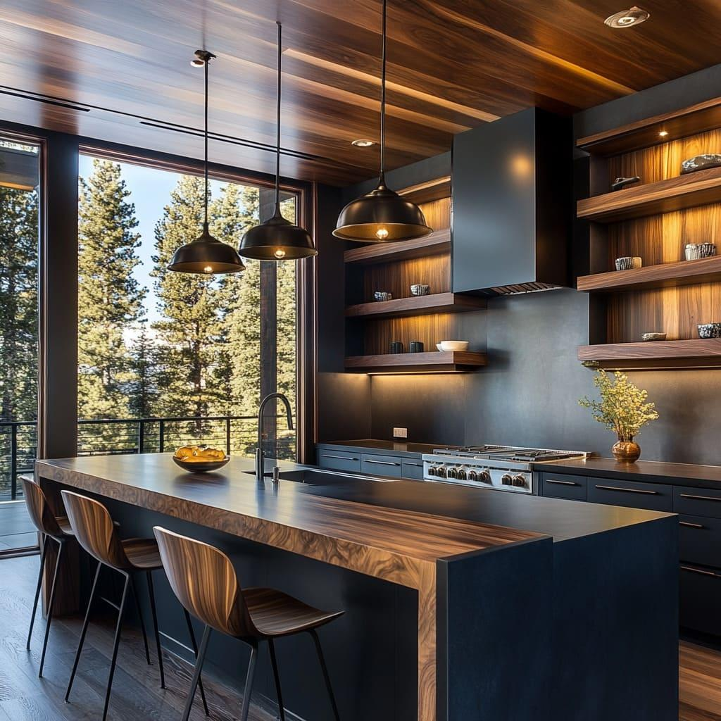
6. Charcoal + Warm Wood — Modern & Dramatic
For homeowners looking for a more dramatic luxury kitchen, charcoal paired with warm wood creates a sophisticated architectural look. The dark cabinetry adds depth, while wood introduces warmth and prevents the space from feeling too stark. Current 2026 kitchen trends are showing greater interest in moody neutrals combined with warm woods.
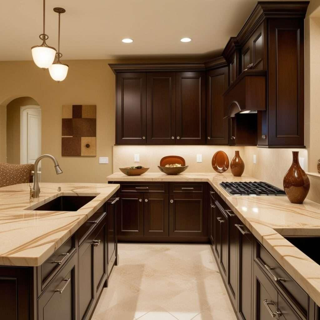
7. Cream + Coffee Brown — Warm & Sophisticated
Cream and coffee brown create a welcoming palette that works particularly well in larger Indian kitchens. Cream keeps the room bright, while brown adds richness and depth. Natural stone, wood grain and warm lighting can further enhance this combination.
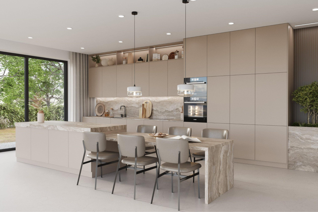
8. Pale Beige + Ivory — Soft & Luxurious
Pale beige and ivory create a bright, understated kitchen that feels spacious and sophisticated. This combination works particularly well with light marble, champagne-toned hardware and subtle wood accents.
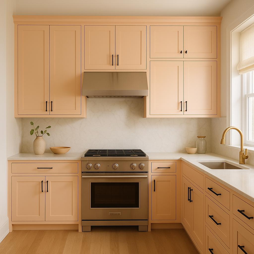
9. Peach + Warm White — Bright & Welcoming
Soft peach paired with warm white introduces colour without overwhelming the space. It creates a fresh, cheerful and contemporary kitchen, particularly when balanced with light wood and neutral countertops.
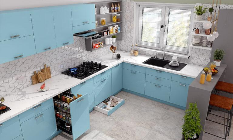
10. Pale Blue + White — Fresh & Airy
Pale blue and white are ideal for creating a kitchen that feels light, open and refreshing. Adding natural wood or brushed brass prevents the palette from feeling too cool.
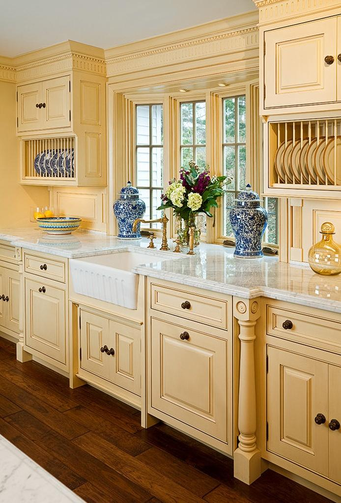
11. Butter Yellow + Cream — Warm & Cheerful
Butter yellow is a softer alternative to stronger yellow tones. Paired with cream, it creates a warm, welcoming and subtly playful kitchen while retaining an elegant appearance.
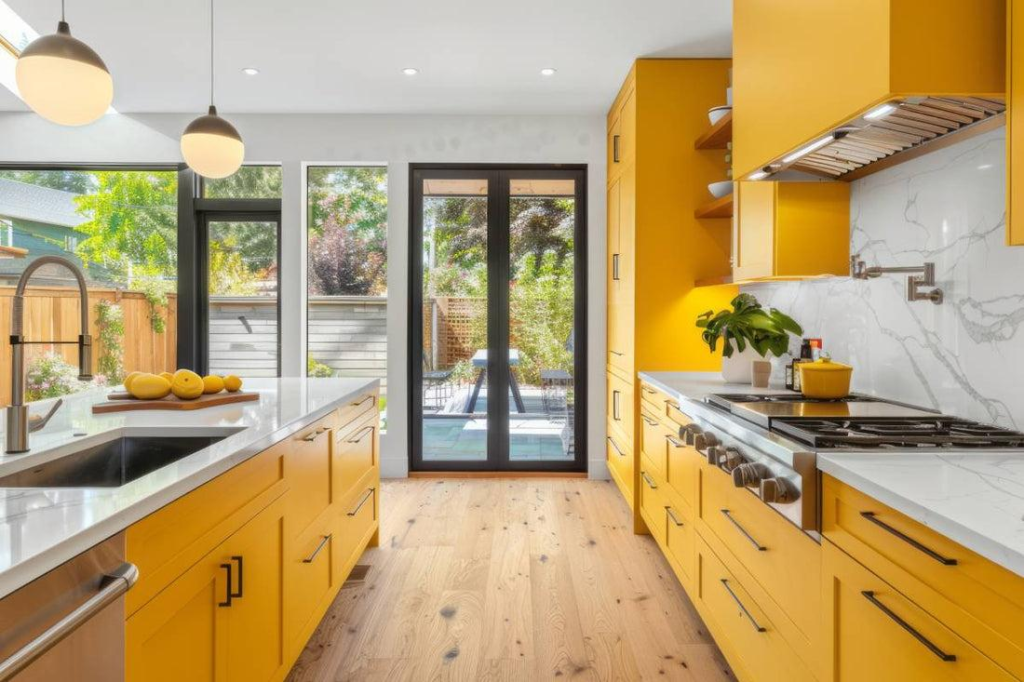
12. Bright Yellow + White — Cheerful & Fresh
Bright yellow adds energy and warmth to the kitchen, while warm white balances the brightness and keeps the space elegant. This combination works beautifully in contemporary kitchens with natural light, simple cabinetry and subtle wooden accents.
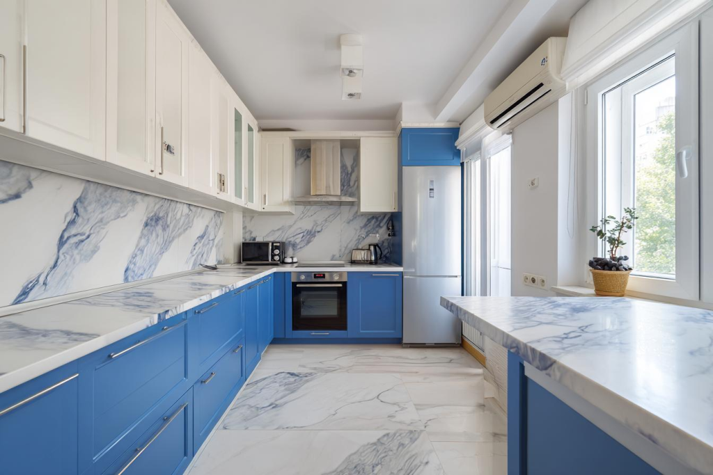
13. Bright Blue + White — Bold & Refreshing
Bright blue creates a striking focal point, while white keeps the overall kitchen light and balanced.
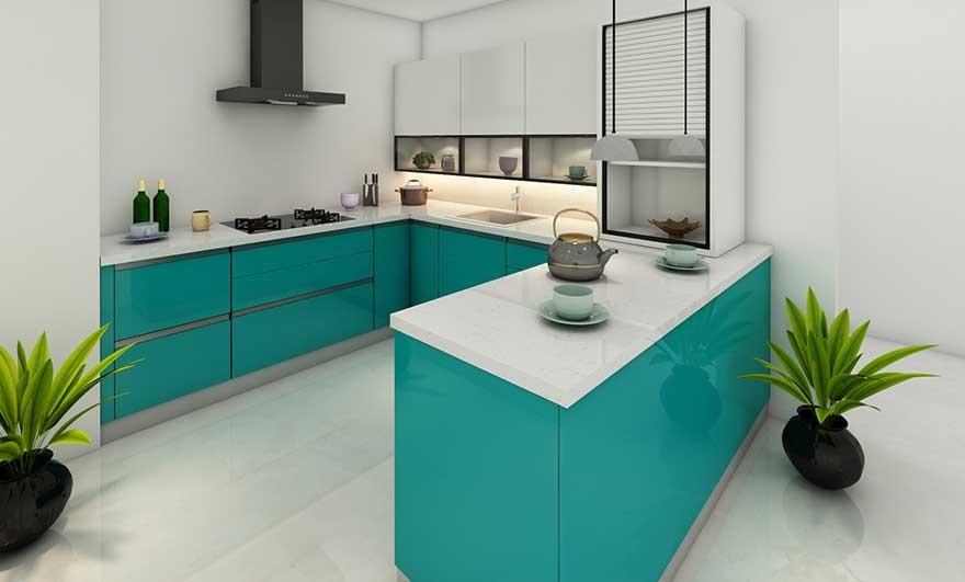
14. Turquoise + White – Bold & Fresh
Turquoise is a striking choice for homeowners who want more colour in their kitchen. White surfaces help balance its intensity, creating a fresh and energetic interior that works particularly well with sleek cabinetry and modern finishes.
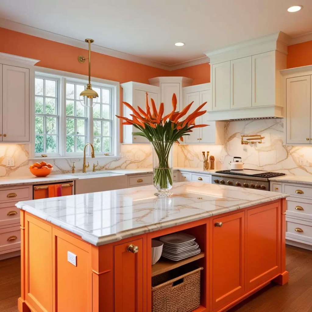
15. Orange + Off-White – Warm & Vibrant
Orange brings warmth and personality to the kitchen, while off-white tones soften the overall look. It is a lively combination that can work beautifully with natural wood, brass details and minimalist cabinetry.
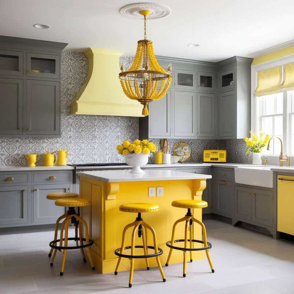
16. Lemon Yellow + Pale Grey – Modern & Energetic
Lemon yellow instantly brightens the kitchen, while pale grey adds a sophisticated contemporary touch. Together, they create a balanced colour palette that feels energetic without appearing too overwhelming.
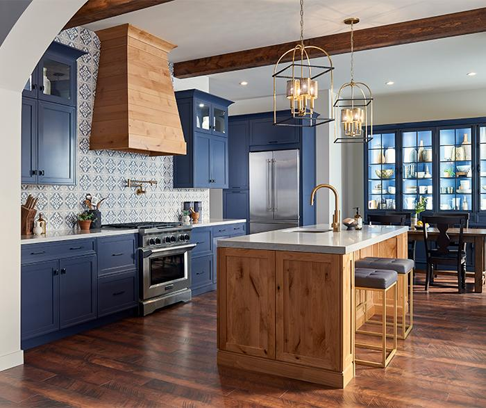
17. Royal Blue + Natural Wood – Bold & Luxurious
Royal blue creates a strong and luxurious focal point, while natural wood introduces warmth and texture. This combination is ideal for larger kitchens or statement islands where bold colour can be balanced with natural materials.
Mistakes to Avoid When Choosing Kitchen Colour Combinations
Choosing the right kitchen colour combination is not just about picking colours that look beautiful individually. The colours should work together with the kitchen size, natural lighting, cabinetry, countertops, flooring and overall home interiors. Here are some common mistakes to avoid:
1. Choosing Too Many Colours
Using too many colours in one kitchen can make the space look busy and unorganised. Ideally, choose two main colours with one subtle accent to create a balanced and sophisticated appearance.
2. Ignoring Natural Lighting
A colour that looks beautiful in a showroom may appear completely different in your kitchen. Dark shades can make a poorly lit kitchen feel smaller, while brighter and lighter colours can help reflect natural light and create an airy feel.
3. Using Only Trends
Following the latest kitchen colour trends can be tempting, but trends can change quickly. Instead, choose a timeless base colour and introduce trendy shades through islands, backsplashes, accessories or accent cabinetry.
4. Not Considering the Kitchen Size
Dark and bold colours can work beautifully in large kitchens but may visually reduce the size of a smaller space. For compact kitchens, consider white, cream, pale green, soft blue, beige or warm neutral shades to create a more spacious appearance.
5. Matching Everything Too Closely
Your cabinets, walls, countertops and backsplash do not need to be exactly the same colour. Using slightly contrasting shades adds depth, dimension and visual interest to the kitchen.
6. Forgetting About Countertops and Backsplashes
Cabinet colour should always be considered alongside the countertop and backsplash. A bright cabinet colour paired with a heavily patterned countertop can make the kitchen feel overwhelming. For bold cabinetry, simpler surfaces often create better balance.
7. Choosing Colours Without Testing Samples
Paint, laminate and wood finishes can look different depending on lighting and surrounding materials. Always test colour samples in the actual kitchen and observe them during morning, afternoon and evening light before making the final decision.
8. Using Dark Colours Everywhere
Deep navy, charcoal, forest green and dark brown can create a luxurious appearance, but using them across every surface may make the kitchen feel heavy. Balance darker colours with warm whites, lighter countertops, natural wood or good lighting.
9. Ignoring the Overall Home Interior
The kitchen should feel connected to the rest of the home. A colour combination that looks attractive on its own may feel disconnected if it clashes with the living room, flooring or adjoining spaces. Consider the overall interior colour palette before making your selection.
10. Overlooking the Finish of the Material
The same colour can look completely different in matte, gloss, woodgrain or textured finishes. For a sophisticated kitchen, think about both the colour and material finish rather than choosing a shade alone.
11. Using Bright Colours Without a Neutral Balance
Bright yellow, orange, coral, turquoise or vivid green can add personality, but they are best balanced with neutral shades. Pairing bright colours with cream, ivory, warm white, beige or natural wood can make the kitchen feel more elegant and timeless.
12. Forgetting Long-Term Practicality
The kitchen is a high-use space, so colour selection should also consider maintenance. Very light surfaces may show stains more easily, while very dark glossy finishes can highlight fingerprints and dust. Choose colours and finishes that suit your lifestyle and maintenance preferences.
Conclusion
The correct Modular Kitchen Colour Combinations do more than please the eye—they solve real-world challenges, from camouflaging spice splatters to enhancing natural light in Bangalore’s compact spaces. Whether you’re drawn to the earthy warmth of terracotta and sage or the bold contrast of navy and mustard, each palette we’ve explored merges 2026 trends with timeless Indian practicality.
For those seeking precision in execution, especially when integrating materials like humidity-resistant laminates or UV-protective finishes, the expertise of Home Interior Designers in Bangalore proves invaluable. They bring localized knowledge, from monsoon-proofing cabinet joints to sourcing the perfect shade of Kota stone to complement your walls.
FAQs
1. What are the most common mistakes when choosing kitchen colours?
The most common mistakes include choosing too many colours, ignoring natural lighting, following trends without considering the overall home, and not coordinating cabinet colours with countertops, flooring and backsplashes. Testing colour samples in the actual kitchen can help avoid costly design mistakes.
2. How many colours should be used in a kitchen?
Using two main colours with one accent shade usually creates a balanced kitchen design. The dominant colour can be used for the main cabinetry, the secondary colour for an island or lower cabinets, and the accent colour for handles, lighting, backsplash or décor.
3. Which kitchen colours make a small kitchen look bigger?
Light and warm shades such as white, ivory, cream, pale beige, soft blue and light green can make a small kitchen feel brighter and more spacious. Glossy or reflective surfaces can also help distribute light throughout the space.
4. Should kitchen cabinets match the countertop?
Kitchen cabinets do not need to exactly match the countertop. In fact, using complementary or contrasting colours can add depth and character. For example, warm white cabinets can work well with natural stone, wood-toned surfaces or subtly patterned countertops.
5. Are bright colours suitable for modern kitchen designs?
Yes, bright colours can work beautifully in modern kitchens when they are balanced with neutral shades. Colours such as yellow, coral, turquoise, bright green and blue can be used on an island, selected cabinets or accents while keeping the remaining elements neutral.
6. Should I choose a trendy kitchen colour or a timeless colour?
A timeless base colour is generally a safer long-term choice, while trendy colours can be introduced through smaller elements. Warm white, beige, cream and natural wood can provide a timeless foundation, while a fashionable colour can be added through an island, backsplash or accessories.
7. How does lighting affect kitchen colour selection?
Lighting can significantly change how a colour appears. Natural daylight can make colours look brighter, while warm artificial lighting can make some shades appear richer or more yellow. It is best to check colour samples at different times of the day before finalising the kitchen palette.
8. How can I choose a kitchen colour combination that matches my home?
Start by considering the colours and materials already used in adjoining spaces, including flooring, walls, furniture and living areas. Choose kitchen colours that complement these elements rather than creating a completely separate palette. This helps the kitchen feel cohesive with the rest of the home.
The KariGhars: A Journey of Design Excellence and Recognition
Founded in 2009 by Aashita Chadha and Abhishek Chadha, The KariGhars has grown into a leading name in luxury interior design, known for thoughtful design, skilled craftsmanship and homes that reflect the people who live in them. The firm’s work has earned it the Best Luxury Villa Interior Design award at the Luxury Lifestyle Awards 2022 and the Brand Achievers Award for Best Interior Designing Firm in Bengaluru. Its design philosophy has also been featured in Vogue India and The New Indian Express, cementing its reputation as one of Bangalore’s foremost luxury design studios.